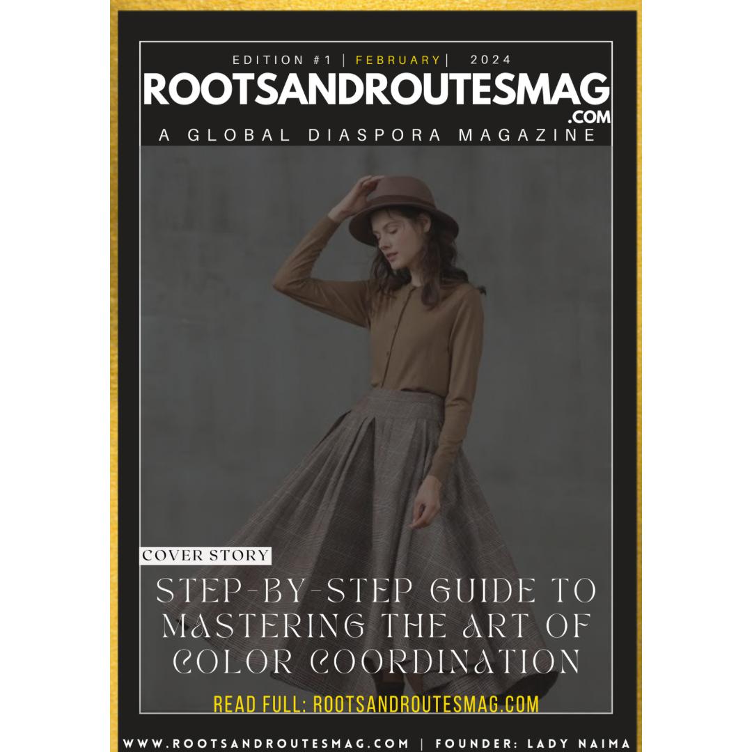
Step-by-Step Guide to Mastering the Art of Color Coordination
Color coordination is an art form that can elevate any outfit, interior design scheme, or creative project. Whether you’re choosing an ensemble for a special occasion or decorating your living space, understanding the principles of color harmony and coordination can help you achieve visually stunning results. In this step-by-step guide, we’ll explore the fundamentals of color theory and provide practical tips to help you master the art of color coordination with confidence and flair.
Step 1: Understand the Basics of Color Theory
Before diving into color coordination, it’s essential to familiarize yourself with the basics of color theory. The color wheel is a fundamental tool that organizes colors according to their relationships and properties. Primary colors (red, blue, yellow) form the basis of the color wheel, while secondary colors (green, orange, purple) are created by mixing primary colors. Tertiary colors are formed by combining primary and secondary colors. Understanding the relationships between colors—such as complementary, analogous, and triadic—will serve as a valuable foundation for effective color coordination.
Step 2: Identify Your Color Palette
When coordinating colors, start by identifying a color palette that resonates with your vision and aesthetic preferences. Consider factors such as mood, season, occasion, and personal style when selecting colors. Experiment with different combinations of hues, shades, and tones to create a harmonious and visually appealing palette. Keep in mind that contrasting colors create drama and visual interest, while monochromatic schemes offer elegance and sophistication. Choose colors that complement each other and reflect the mood or theme you wish to convey.
Step 3: Use the 60-30-10 Rule
A simple guideline for achieving balance and cohesion in color coordination is the 60-30-10 rule. Divide your color palette into three proportions: 60% dominant color, 30% secondary color, and 10% accent color. The dominant color serves as the primary hue that anchors your scheme and sets the tone for the overall look. The secondary color complements the dominant color and adds depth and interest, while the accent color provides pops of contrast and visual emphasis. Experiment with different proportions to achieve the desired balance and impact.
Step 4: Consider Color Temperature and Intensity
In addition to hue and saturation, consider the temperature and intensity of colors when coordinating your palette. Warm colors (red, orange, yellow) evoke energy, vibrancy, and warmth, while cool colors (blue, green, purple) convey calmness, serenity, and sophistication. Pay attention to the intensity or brightness of colors, as vibrant hues can create focal points and draw attention, while muted tones offer subtlety and sophistication. Balance warm and cool tones to create visual harmony and contrast in your color scheme.
Step 5: Embrace Texture and Contrast
Texture and contrast play a vital role in enhancing the visual impact of color coordination. Experiment with different textures, patterns, and finishes to add depth, dimension, and tactile interest to your design. Mix smooth and rough textures, matte and glossy finishes, and solid and patterned elements to create dynamic visual effects. Contrast light and dark tones, bold and neutral colors, and complementary and analogous hues to create visual interest and balance in your color palette.
Step 6: Trust Your Instincts and Experiment
Ultimately, mastering the art of color coordination is a creative process that requires experimentation, intuition, and personal expression. Trust your instincts and don’t be afraid to step outside your comfort zone. Play with unexpected color combinations, explore new palettes, and embrace the element of surprise in your designs. Allow yourself the freedom to experiment, refine, and evolve your color coordination skills over time. Remember that creativity knows no bounds, and the journey of discovery is as rewarding as the destination.
Conclusion: Express Yourself with Confidence and Creativity
Color coordination is a powerful tool for self-expression, communication, and creativity. By understanding the principles of color theory, identifying your color palette, using the 60-30-10 rule, considering color temperature and intensity, embracing texture and contrast, and trusting your instincts, you can master the art of color coordination with confidence and flair. Whether you’re styling an outfit, decorating a room, or embarking on a creative project, let your imagination soar and your colors shine bright. With practice and passion, you can create harmonious and visually captivating compositions that reflect your unique personality and aesthetic sensibilities.